

Ridge
Ridge CD
Austin Dutra
Designer
Taylor Schultz
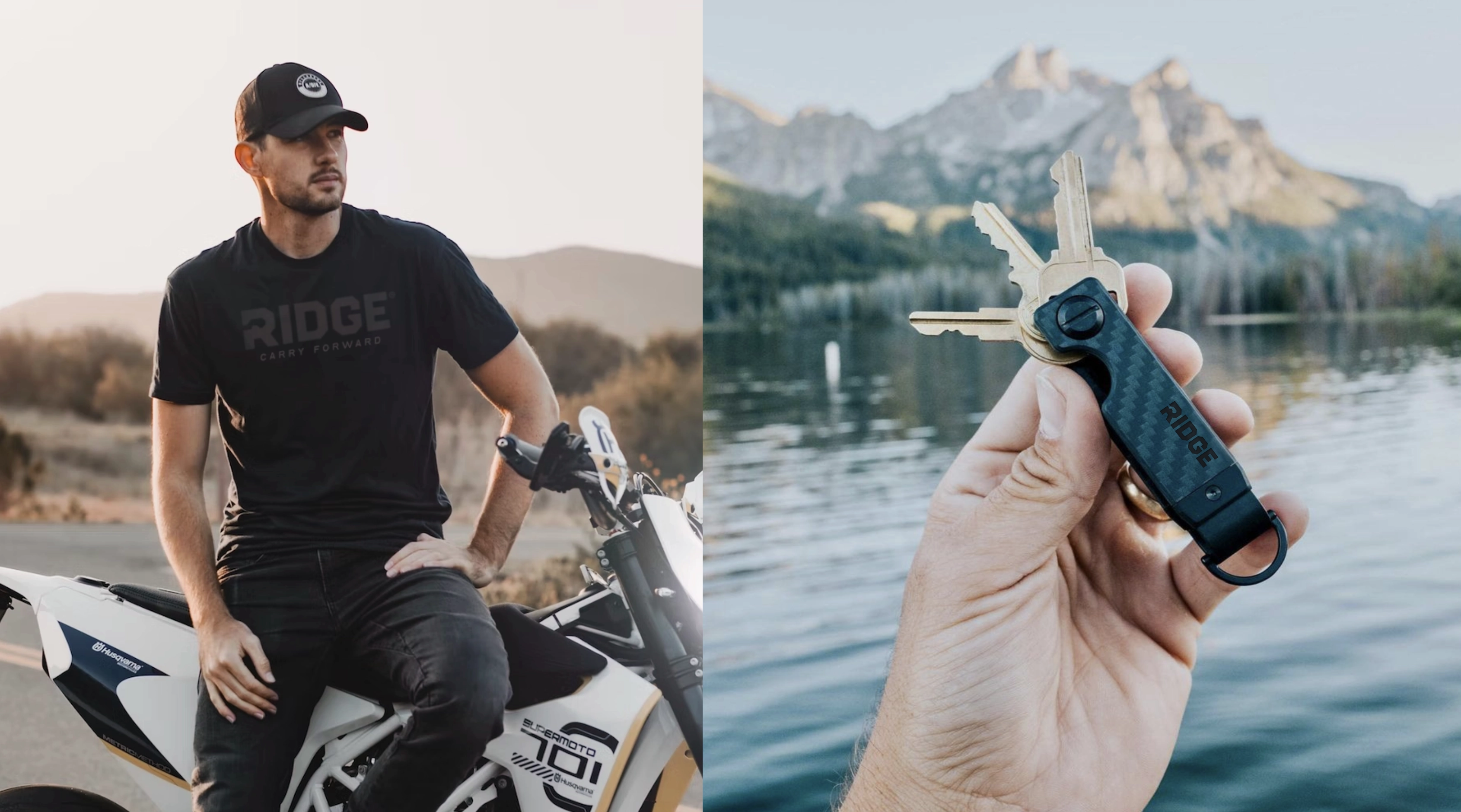
I worked with Ridge for a couple of years doing wallet mockups, campaign assets, the ongoing stuff that keeps an ecommerce brand moving, which eventually turned into a much bigger ask: rethink the identity.
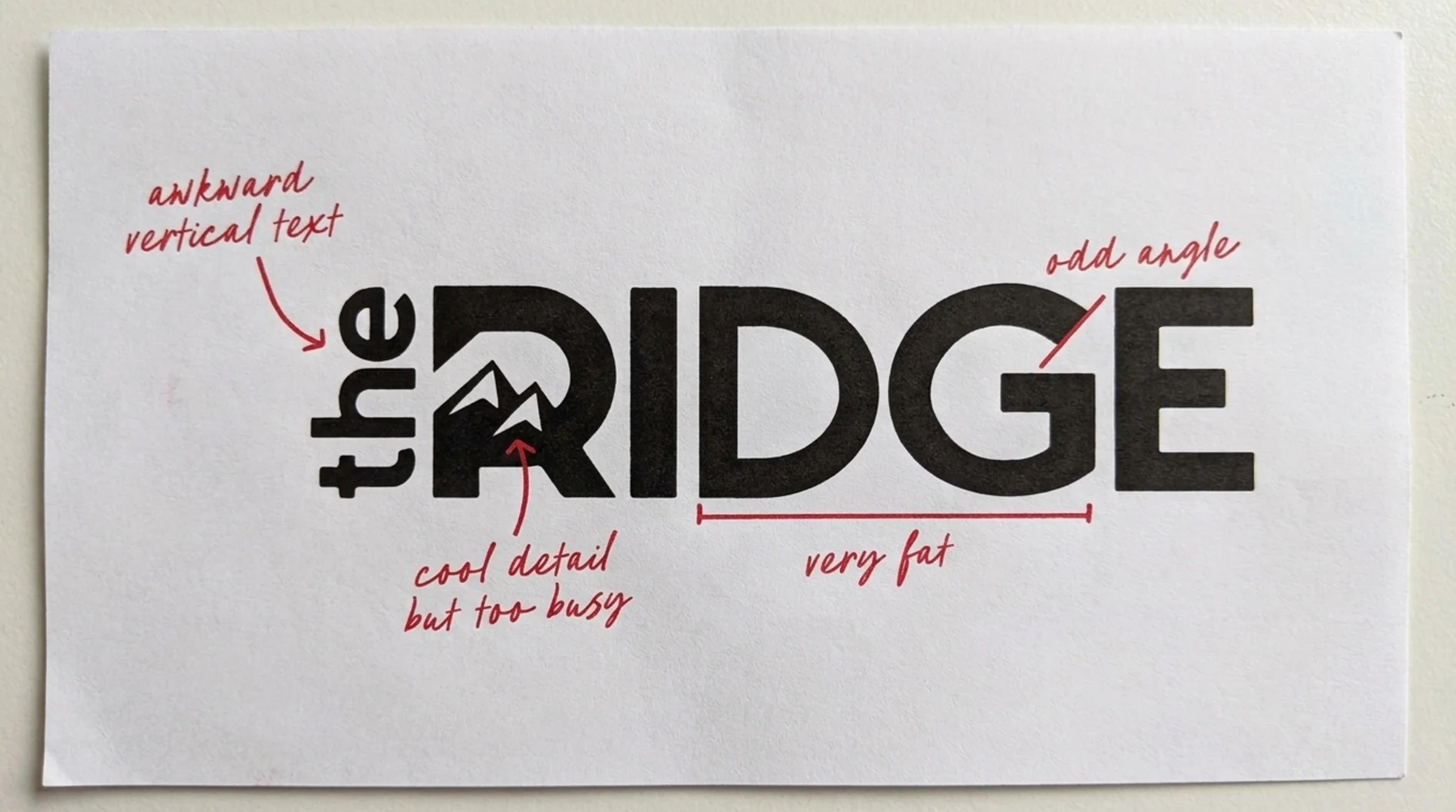
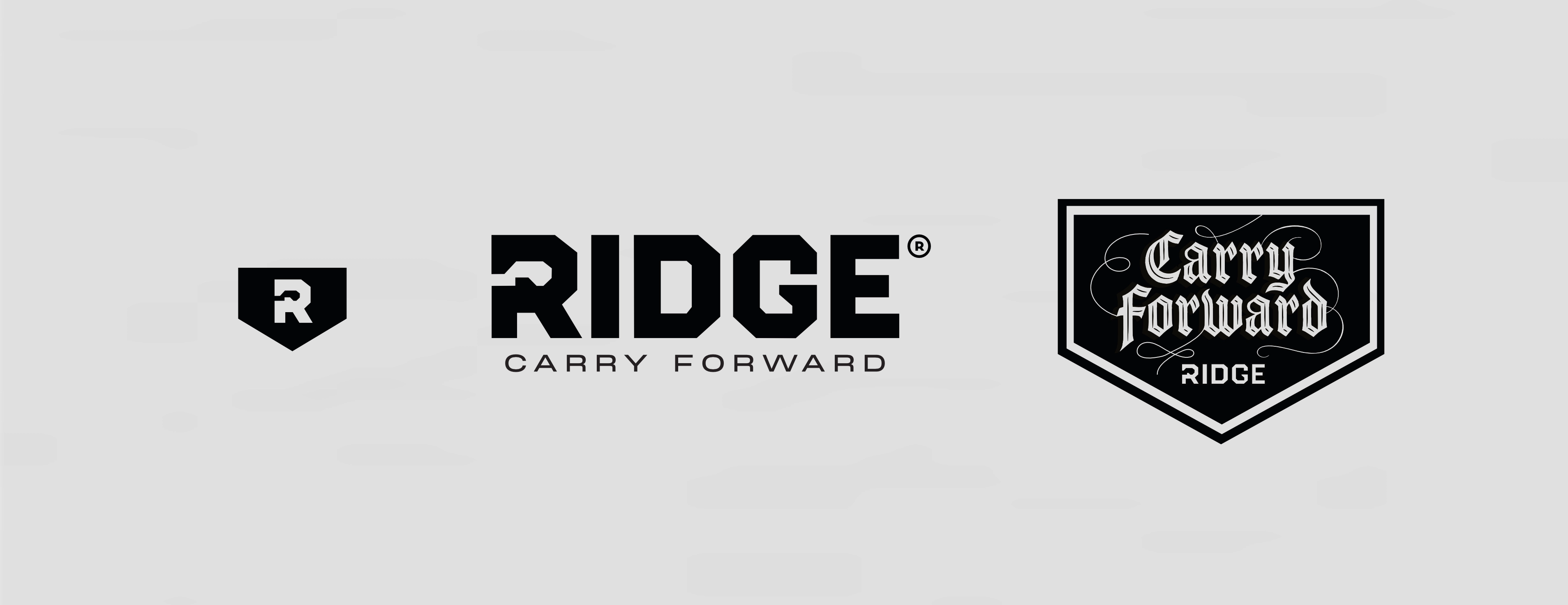
The old logo had some friction. The vertical "THE" running up the side hurt legibility. The letterforms didn't quite hold together. And the little mountain range tucked inside the 'R' was a nice touch, but it was too much fine detail to survive everywhere a logo has to go .
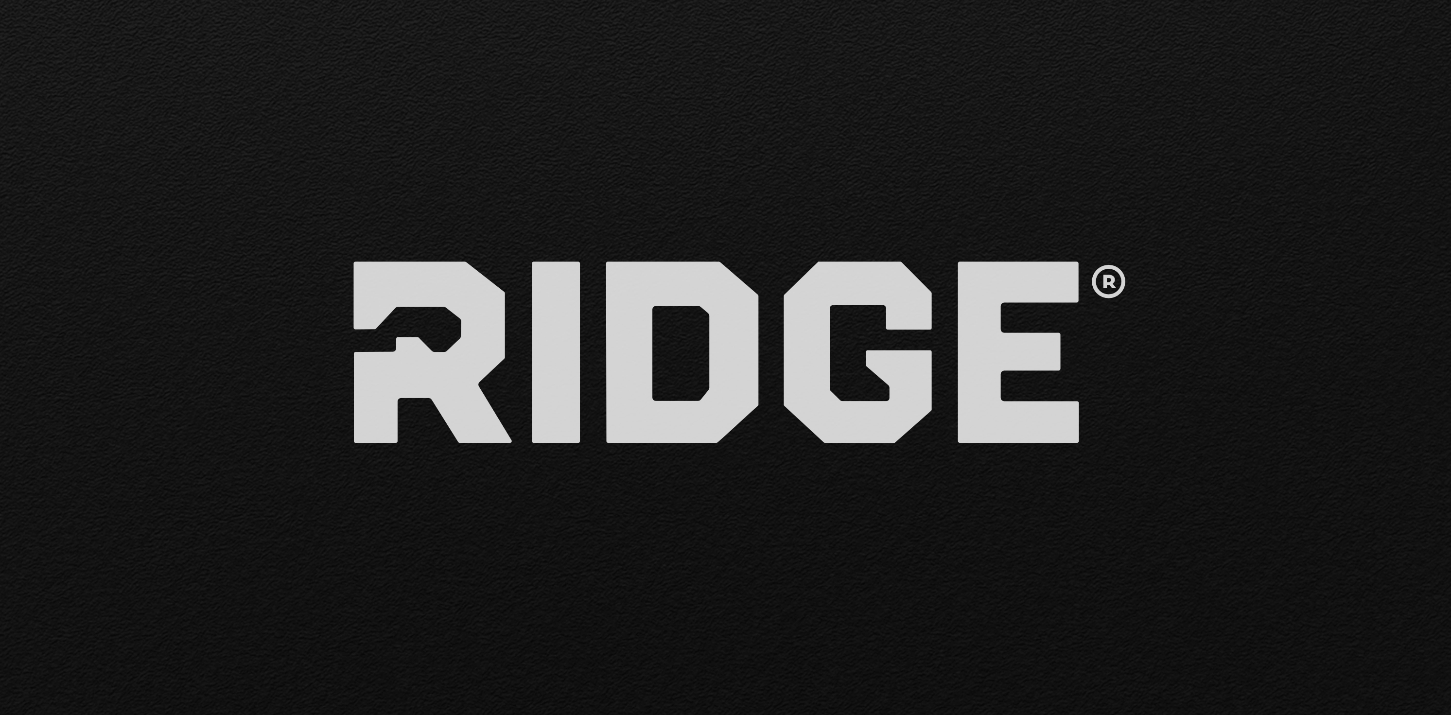
I rebuilt the wordmark around more utilitarian letterforms — straight and diagonal edges instead of curves, to match how the product actually feels: rugged, no-nonsense.
To keep the spirit of that mountain detail without the complexity, I worked a subtle notch into the R, shaped like a carabiner clip. Quieter, but it does two jobs at once: it nods to the climbing and adventure world, and it points straight back at what Ridge makes — everyday carry.
At the same time, I also felt that the tagline should get the same treatment.
"Carry Less, Live More" was fine, but unneccessarily vague, and half the e-commerce niche was already saying some version of it. I swapped it for "Carry Forward."
It works literally — carry, as in what you've got on you — and it points somewhere: forward, ahead, toward something. A line with a little more backbone.
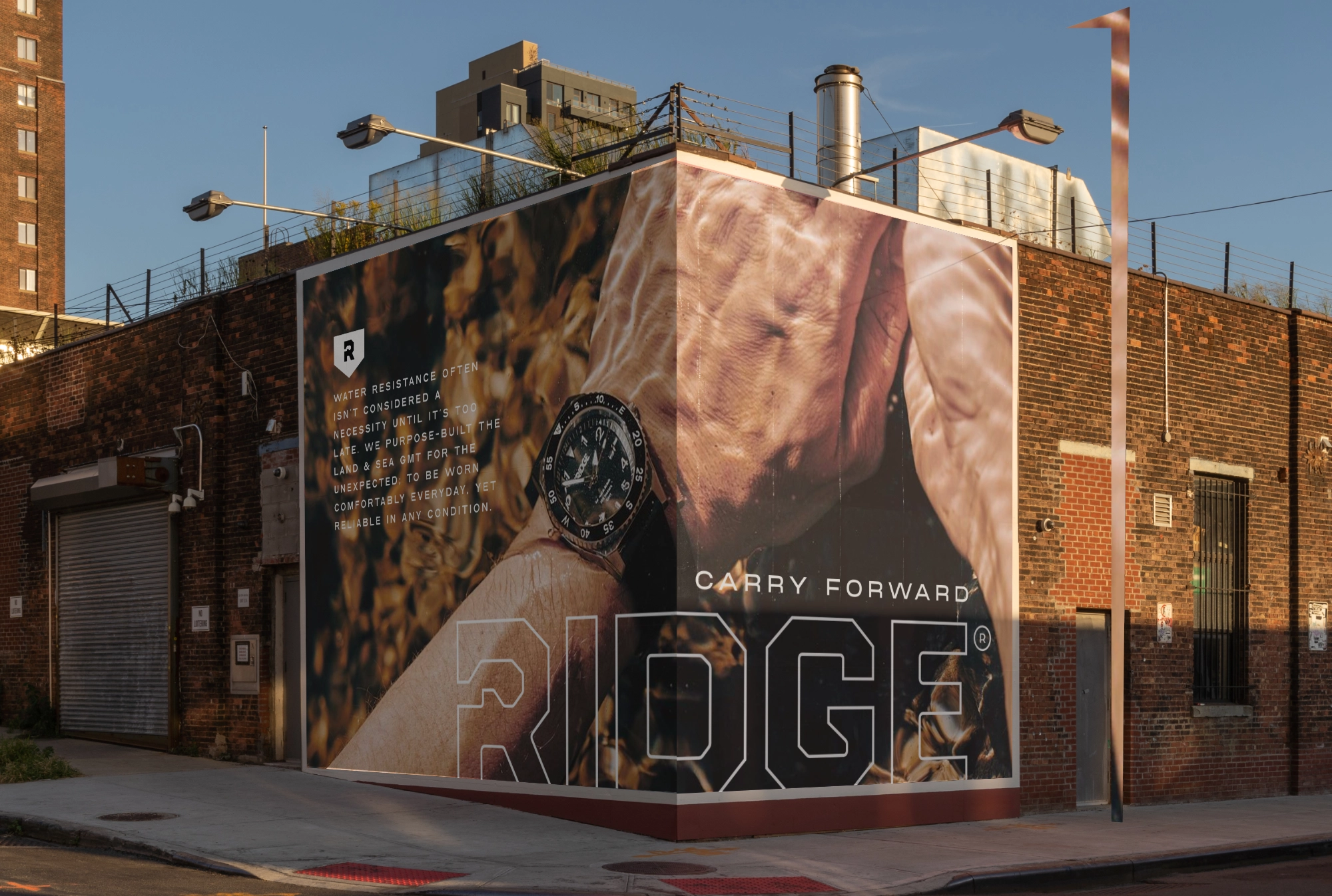
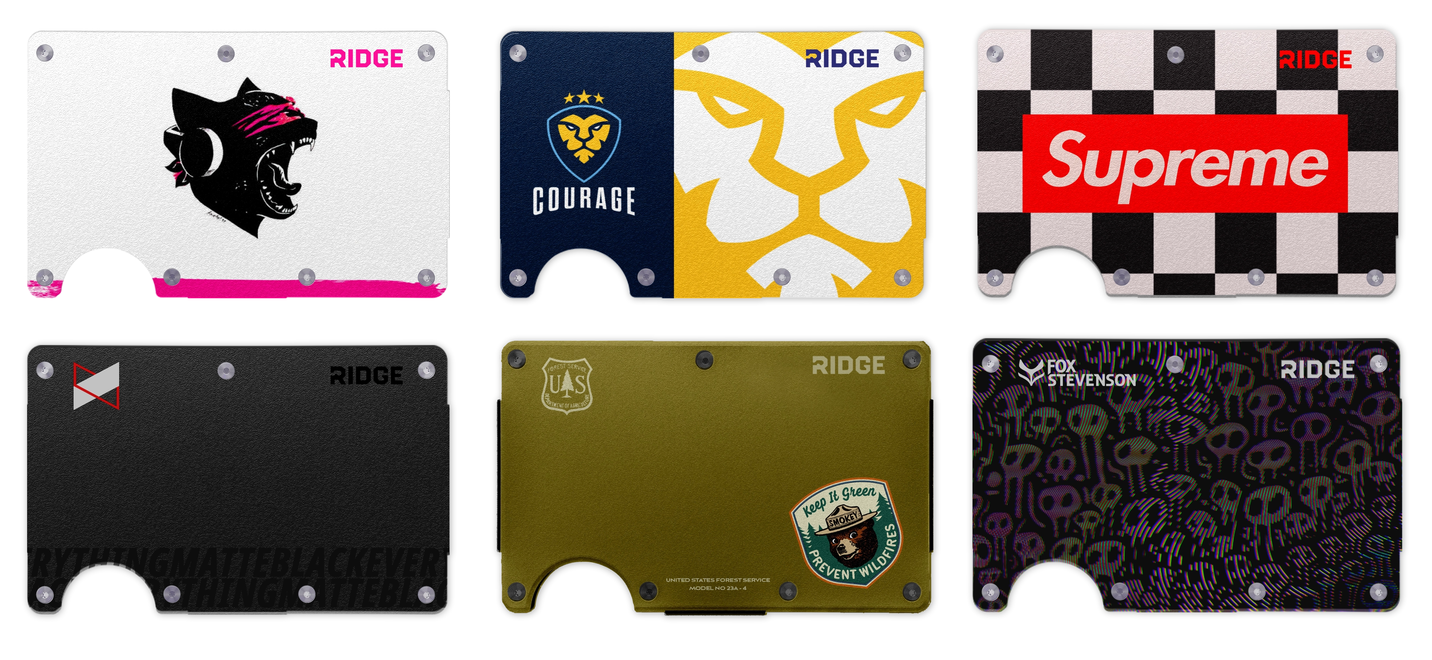
Alongside the identity, I concepted a run of collaboration wallets to stress-test the new system against wildly different audiences — Monstercat, 100 Thieves, Supreme, Smokey Bear, Fox Stevenson, and MKBHD.
Each one was a way to prove the new mark could keep its own identity while flexing into streetwear, gaming, public-service messaging, and creator-tech worlds without falling apart.