


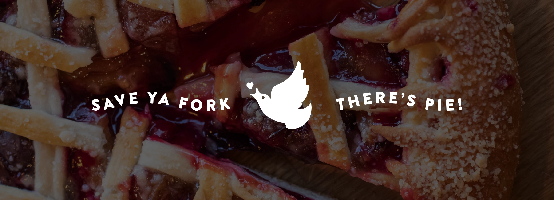
Four & Twenty Blackbirds
Taylor Schultz
Four & Twenty Blackbirds is a Brooklyn institution - two sisters who started custom-baking pies in their Crown Heights apartment. The pie is genuinely some of the best there is.
I used to live near one location and work near another, so Four & Twenty was a fixture of my weekly routine. The one thing that never quite matched the pie was the logo: a circular mark that leaned a little Futura-heavy and a bit uninspired.
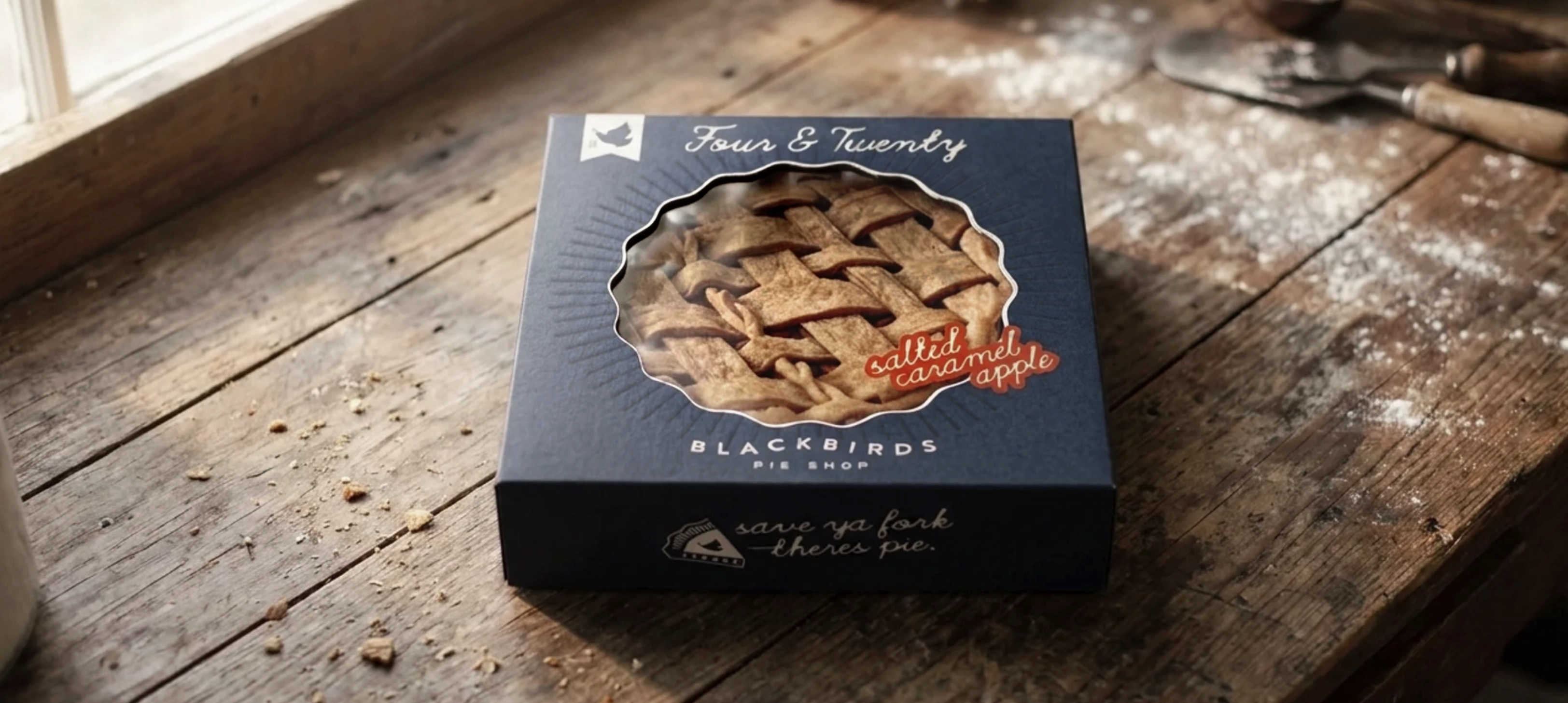
This was a self-initiated concept rebrand: a love letter to a place I spent a lot of coffee-and-a-slice mornings.
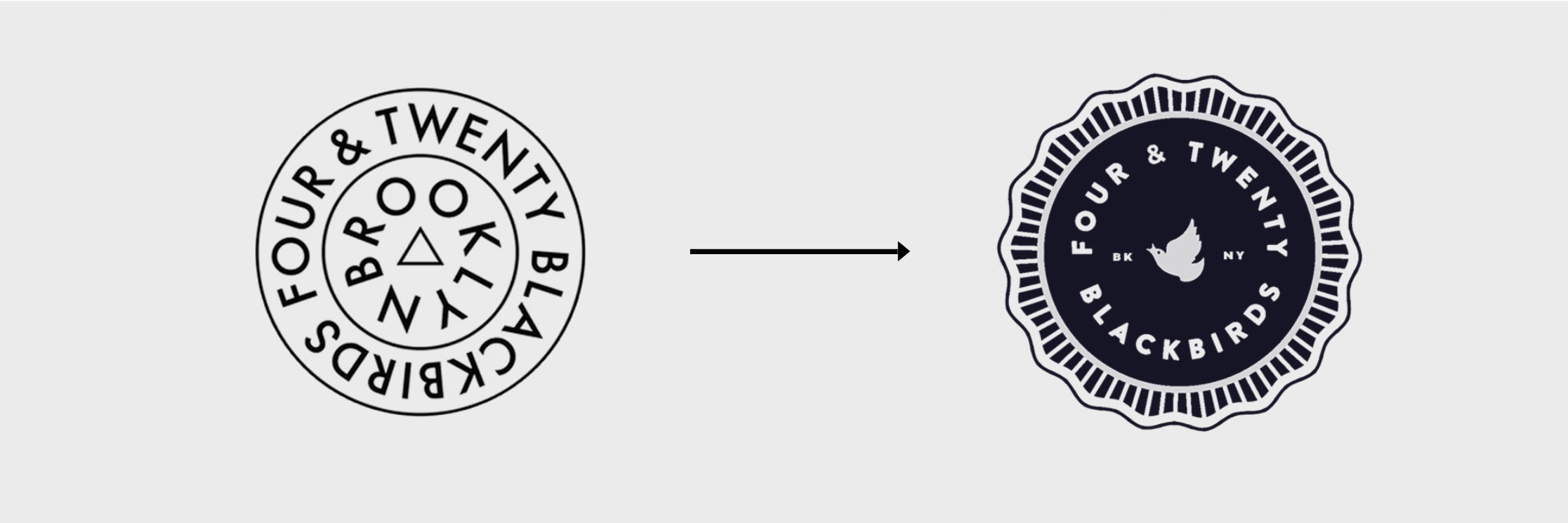
The idea was to keep what was already there and make it earn the shape. The original circle turned into a pie shape, crust and all, so the mark means something instead of just being generically round.
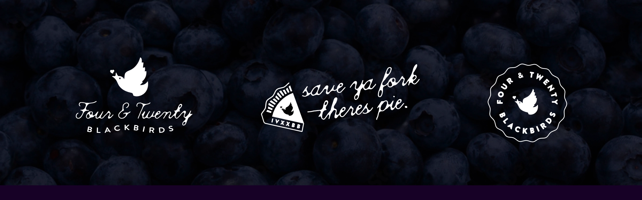
The centerpiece is a new icon: a pie bird - a little ceramic bird bakers historically set in the center of a pie to vent the steam. It gives the brand an alternative mark with a story instead of just a monogram.
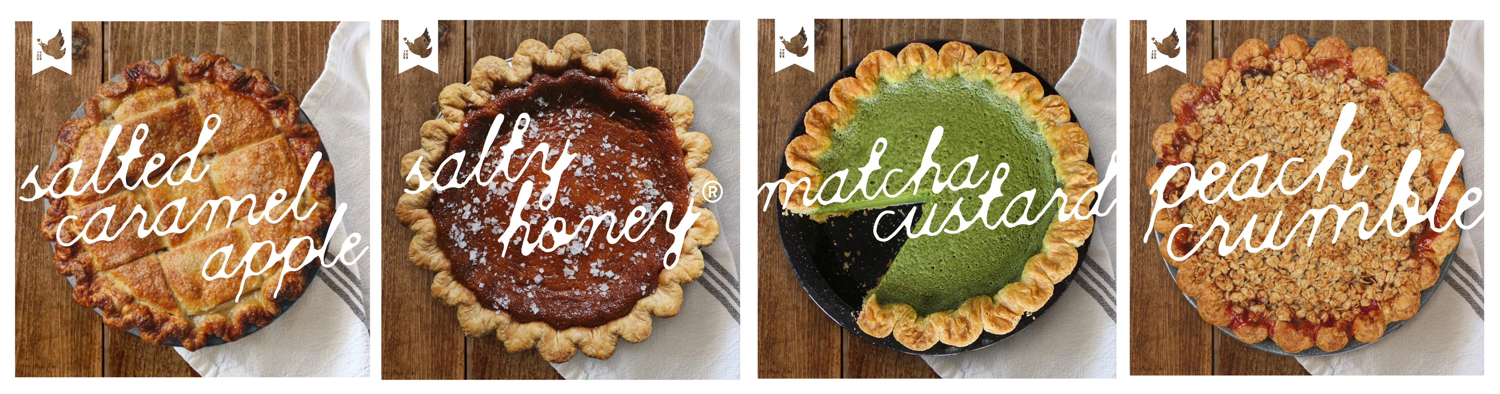
Included an updated font pairing as well.
*This was a concept, not a commissioned rebrand — a personal exercise on a place I love. Four & Twenty's own line, "save your fork, there's pie," is still one of the best in the business, and it's the kind of brand voice worth designing up to.